Monday, 17 November 2014

Digipak questionnaire results and analysis

Our group memeber, Laura, has designed a questionnaire for research on the digipak. I asked 20 people of the age range 16-20, 9 questions to find out a little more information about what they would like to see on a digipak. We will use all of our results when coming to designing the digipak. I have put the questionnaire results into different graph styles to make it easier and clearer for you to see when i come to talking about each question.

Question 1:
What would you prefer to see on the front cover of the digipak?
A: A scenic photograph
B: Band photo
C: Artist illustration
D: City landscape


As you can see from the pie chart above, over half of the audience members i asked said they would prefer to see a professional band photo rather than the other 3 options. I think this is because many current artists/bands tend to do this on their album covers. Also, an image is better for recognising the band, and when the audience want to connect with the band or artist. Since our aim is to make the band seem as realistic as possible, a band photo would be the best option as it is realistic, a common aspect, and our audience is able to connect our video with the album more clearly.

Question 2:
How many songs would you expect to see on the back of the album cover?
A: 5 to 10
B: 10 to 15
C: 15-20


The bar chart above clearly presents that the most common answer for this question was 10-15. In my opinion i would have gone for this option aswell as it is just the correct amount of songs for an album cover. I feel and i think the audience would have felt that 5 to 10 would have been too less and 15 to 20 would have been too many. This brings us to the next stage of making up appropriate named songs. The songs are important because they need to be realistic and suitable for an alternative/indie album. It would also be good if we included some live versions, or remixes of the songs on the back for a more conventional look.

Question 3:
What kind of colour scheme do you think would be suitable?
A: Simplistic
B: Mysterious
C: Bright
D: Natural

The pie chart above presents that the majority of the members of our audience research group chose that they would think a Simplistic colour scheme would be the best choice for our digipak. A few of the members also thought the Mysterious colour scheme could look like a good colour scheme for the album, however the bright and natural colour scheme were less popular. A simplistic colour scheme is quite conventional for an indie album cover, as it is probably the most common style used in that genre.

Question 4:
Any extra elements for the digipak?

Half of the group of people thought that the most important extra element would be the album name. An album name is a very important aspect as it adds something to the cover. The element of a bar code was also quite popular. I can imagine this is because it is a realistic element for a CD. The production company and logo weren't as popular, however these could still be used for smaller elements on the back of the digipak.

Question 5:
How much would you usually pay for an album?
A: £5-10
B: £10-15
C: £15+

As clearly shown in the bar chart, people would usually bay around ten to fifteen pounds for a new CD or album. Price isn't extremely important for the digipak however i collected the result as a little more extra research in case we struggle to fill space. 

Question 6:
Preferable album cover.
A: Florence and the machine
B: Arctic Monkeys 
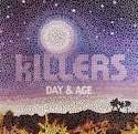
C: The Killers
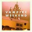
D: Vampire Weekend


The most popular digipak out of the four was the cover of Vampire Weekend. This cover is very simplistic, which is also the colour scheme the audience wanted for our digipak. As shown in the pie chart above, the Arctic Monkeys album cover was the least popular. I think this is because it is almost too simple, and doesn't even advertise the band. This could be because of their particular mysterious style that they have. In my opinion i personally prefer the vampire weekend album, however i think a band photo or a location could have been used to make it slightly similar to what we're going for.

Question 7:
What usually catches your eye on an album cover?
A: Band name
B: Cover image
C: General text
D: Colours

 
The most common answer for what was eye catching on an album cover was the cover image. From this result we need to make sure that our cover image is the first thing the audience look at, and that it is so powerful it diverts the audience attention straight away from everything else on the page. The second most popular answer was the band name. Obviously this is a much needed element for a digipak. The band name also needs to be an element that attracts the audience's attention.
 
Quesion 8:
Do you think the album art work is important and should link with the music?
The majority of our questionnaire audience voted "yes" for this question. 2 out of the 20 people voted "no" and decided that it wasn't essential for the art work to be linked to the music style. I think in terms of colour scheme, logo and band name, there should be a link with the album tracks, however art work such as the photo or any other illustration isn't as important.
 
Question 9:
What do you think could be additionally added to the final product for a little extra effect?
A: Lyrics inside cover
B: Different versions of songs
C: Inside images of artist illustration
 
The most popular answer for this question was "B: Different versions of songs". I personally also think this is the best option as it makes the back of the digipak look more realistic. It is a particularly conventional think to advertise different or live versions of songs or something like a feature DVD movie. The second most popular option was "A: Lyrics inside cover". This also used to be quite a conventional element for an album however is not so popular anymore.
 
We will take all of this into account when coming to designing and creating our digipak. I think the results of this questionnaire has really helped our group for ideas, in creating a very successful and professional digipak. 


1st photoshoot for digipak and advert


As well as filming our band performance we decided to make the most of our location and take photos for our advert and digipak of the band. In our location, there was neglected and old brick wall which as a group we thought would fantastic and fit the image of the band. Which we want to be as they are mysterious and bare. For the costumes, we decided that we wanted our lead singer to stand out from the rest of the band which would match the conventions of an indie band. Looking at bands like Imagine Dragons and The Killers, the lead singer usually wears something like a jacket or jewelery to make them stand. We decided to go with a leather jacket for our lead singer. This creates the image that suggests that he is quite rebelius and will escape the social norms. Below are some pictures of the photoshoot taking place...  


Sunday, 16 November 2014

16th November Filming Session

In today's filming session we decided that we would film one of the section of the narrative where we finally meet the character's mum. These show the real root of the boy's insercurtities about dance, which start with his mother unacceptance of his passion for dance. Our location for these scenes was a house in West Monkseaton. As a group we decided that this house would be a great location has it would be free to use (as it was one our members of the group's house) and it was in a surban area which would be relatable to our target audince as they would feel like that this could be happening to be around them and maybe including their friends!
 
Lighting played a major role in this filming shoot, as we wanted to create a grey and dark atmosphere which would reflect the life of this boy. In which we want it to be very somber and uncolourful. We used many LED lights to be able to create this affect of dark lighting but still be able to highlight our actors. Furthermore, by using LED lights it will stop the footage from going yellowy and give the grey affect.
 
In this filming session we didn't really use much equpitment to be able to give a hand-held affect. The only equpiment we used was the camera, tripod and the LED lights. The reason why we decided to film these scenes hand-held was that we want to feel like the audience will be following the events of the character, unfolding right in front of them. Below is some pictures taken from the location...


Saturday, 15 November 2014

14th of November Filming in Action

In this filming session, we decided that this space would be best to film our band performance. Below are some photos of filming taking place at our location. 


Friday, 14 November 2014

14th November Location for our Final Cut Band Performance

Today was the final shoot for the band performance for our final cut of the music video. The location we used was warehouse 34 in Hoults Yard, in Byker. This location was amazing to used as it was big, wide open space. Furthermore, it was very industrial building, which matched the image we wanted for the band to be very mysterious and dark. This spaced that we hired had many different aspects to it, as there were white brick walls we could use for lighter shots and darker neglected brick walls for the dark and dramatic shots. Below are some photos of the location we used for this filming session.


14th November Setting up Equipment

In this band performance filming session we booked out many different pieces of equipment to be able to achieve the best possible shots in the time frame we had. The equipment we used was staging (provided by the location), the crane, the dolly, three redheads, smoke machine, tripod and two LED lights. It was a massive operation to get everything to Byker but it was worth it! Furthermore, we also used many different instruments to make our band look professional, such as: a drum kit, microphone and stand, keyboard and guitar.

The staging that was provided by the location was great addition to the music video as we could deliberately pick out certain members of the band to used the convention of the lead singer being shown to be the most important member of the band and the drummer being the highest point (visual) in the band, which can be shown using levels. We built the stage up with a formation of:


Drummer
(Jamie)

                  Guitarist                                                                  Keyboard
                   (Matty)                                                                      (Bill)
Lead Singer
(Lewis)


However, we also had to set up many different technological equipment. The crane that we used came in handy to achieve big master shots of the band to show the location and lighting off. But also the crane help us to be able to film close up shots of the different members of the band and adding movement to them. In addition the crane was good to film static master shots of the band as well. In this film session we also brought three red heads and LED lights. The red heads were used to highlight the band and change colour of the room. On the other hand, we used the LED lights to highlight certain members in the band, in two-shots we shot. In this filming session, we also used a smoke machine. This was a privilege to be able to use this as it really made the image of the band being mysterious and dark, as it looked like they were appearing from the smoke. One of the other pieces of equipment we used was the dolly. In this filming session we used the dolly to create slow pan in the master shots of the band. As the surface in the warehouse we used was very bumpy so we had to place the dolly on some staging so we could get clean shots instead or jerky.  

Thursday, 13 November 2014

Digipak research questionnaire


I have created a questionnaire to hand out to some of our target audience members to find out what they would prefer or expect to see on an alternative genre band's digipak. The results of the questionnaire will hopefully help us when it comes to creating the digipak in terms of colour scheme, photo type, price, track listing, and other elements that need to be included. Once i have collected the results from the questionnaire i will present results in graphs to see clearer what our demographic expects.