This is the finished question 2. The question is about combining the 2 ancillary texts and the music video. We focused on explaining the question in detail instead of creating a parody of a programe to ensure the question was as detailed as possible.
Wednesday, 17 December 2014
Question 2 video
This is the finished question 2. The question is about combining the 2 ancillary texts and the music video. We focused on explaining the question in detail instead of creating a parody of a programe to ensure the question was as detailed as possible.
Goodbye!
As we have come to the end of the project, as a group we have learnt many things that will help in the future, if members of the group are wanting to progess in uni or jobs. Many of the skills and qualites we have learnt or developed are being determinded when people have dropped out, being innoative when planning ideas for the music video, advert and digipak and photography (film capturing) when shooting the music video.
Furthermore, in this A2 media coursework we have finished it with a proffessional product, which can be shown to future employers or unis. This shows to an employer or uni that when we are given deadlines we can stick to them and achieve a proffessional product.
Furthermore, in this A2 media coursework we have finished it with a proffessional product, which can be shown to future employers or unis. This shows to an employer or uni that when we are given deadlines we can stick to them and achieve a proffessional product.
Evaluation deadline day
Today is the day that our evaluation of the each aspect of the project must be in. As this is our last piece of the A2 Media coursework we must finish on a high! Furthermore, was also needs to be handed in is the finished blog that shows all the planning and a guide throughout our project.
Tuesday, 16 December 2014
Question 4 Antiques Roadshow Theme

We chose to use Antiques Roahshow as the theme for the majority of this question to add a sense of humour to the evaluation. This allowed us to analyse and discuss each piece of equipment in detail and explain how we used them. The common questions asked on the show relate around the purpose of the antique, the owners use for it and how good/effective it actually is. These questions were perfect for discussing the equipment as we explained our strong understanding of what they are used for, which shots we used them in and finally how they gave us an advantage over other methods.
We diccussed The Crane, The Dolly, The Shoulder Mount, Redhead Lighting, LED Lighting and the Dixon Camera. The setting we used was the Gazebo in the Courtyard, which helped to meet the posh conventions of the show.
The Day Before the Deadline Day
Today we are filming the finishing touches to be able to have less stress and hassel tomorrow. Manly we will be recording voiceovers for each question where it is needed. However, a lot of the editing will be needed to be done tomorrow which will cause stress levels to be high if someone is at the computer for 5 hours straight.
Monday, 15 December 2014
Filming Question two and three
Today, we started and finshed filming question two and three. For question 2 we used the green screen as this questions is all about how the digipak and advert reinforces the conventions used in the music video. By using the green screen we were able to point to different principles on the products being talked about, to be able show the examiner excatly what we mean. We decided not to base it around a tv show or movies etc, as we thought that this question needed a deatiled explaination for point made. So it would be subtence over style.
For question 3 we decided to base it around Big Brother and having the target audience being in the diary room. By using this style we were able to have the target audience deicussing our video and what we could do to improve it. Then as a group we talk about the results of the target audience feedback and how we acted on it, from our rough cut to our final cut. We also decided to use the green screen for this questiopn as well.


For question 3 we decided to base it around Big Brother and having the target audience being in the diary room. By using this style we were able to have the target audience deicussing our video and what we could do to improve it. Then as a group we talk about the results of the target audience feedback and how we acted on it, from our rough cut to our final cut. We also decided to use the green screen for this questiopn as well.
Friday, 12 December 2014
Question 4 - How did you use media technologies in the construction andresearch, planning and evaluation stages?
Within this question, it will be split into different sections. One section will be Matty talking over a screen cam of what he is doing using a running commentary. This meant that the audience can see what he used during the filming process. It also allows them to see personally how he achieved some of the effects used in the video. This will be shown step by step.
When it comes to the section about the products used to film, we will use the antiques roadshow parody. The parody will be ironic as its stereo typically for the older generation and talking about antiques, where as the products we are using will be almost all modern.
We will be filming this question and also question 1 at the same time due to them being the longest questions and involving the most information.
12/12/2014 Filming
Today, we filmed and began to edit question 4 and question 3. We felt these two questions held the most information and would take the longest to film.We began this morning during our first lesson to film question 1 in front of the green screen. We placed 4 chairs in front of the screen and had wrote a script the night before which meant we were organised and knew what we were saying.
We filmed in front of the green screen so that we could edit the background to look like the video was behind us or whatever product we were talking about within that question. This was the best way to go around things because it allowed us to explain the answer in detail without any information from the answer getting mixed up or missed out.
When we had finished filming question 1, we then moved onto a section of question 4. For a section within question 4, we chose to do a parody of Antiques Roadshow as we thought it was an ironic approach to new technologies etc. that we had used when creating the film.
We shot this section in the courtyard in the new solar hut which resembled where antiques roadshow would of been filmed. Laura was the presenter, Matty played the part of Joe who was an expert and Bethany also played Joyce who was also an expert of the technologies and products used.
After shooting both of the sections of the questions, we encoded the clips onto the editing computer and began to edit. Matty was in charge of editing, whilst Bethany encoded the other question to which he was working on.
Question 3 - What you learned from your audience feedback?

Question 3 we have decided to film a big brother diary room parody, in which we will sit the target audience on the big brothers diary room chair whilst they answer the big brother questions. We used a mind map in order to plan out what we were going to say and which questions we were going to ask the audience.
We began to go through each of the blog posts we had made on the target audience research and chose questions we remember helping us make valuable decisions within the video and what we asked the target audience for their feedback on.
A blog post that help us a lot was the audience feedback that we received from the rough cut as they had many improvements in which we could make and ensure that the audience enjoyed the video. We showed a number of different shots from the roughcut to the audience to see if they felt it should be changed to one of the suggestions made and this would help us make the final decision on whether to carry out the change to the video.
Thursday, 11 December 2014
Script for Question 1


Question 1 was scripted in quite a lot of detail and seperated so each of our group members had something to say. The 2 scripts presented above are made for the music video, and the digipak. Unfortunately last minute the advert script was lost on the day of filming, however we still had the points so were able to briefly improvise for filming that day. As you can see the script for the music video is in much larger detail, this is because there was a lot more to say for this product on question 1, as the music video is the main product, and the digipak and advert are smaller aspects of the project.
Tuesday, 9 December 2014
Question 1 - In what ways does your media product use, develop or challenge forms and conventions of real media products?

For this question we shall be sitting in front of the green screen with the sections of the project we are talking about in the background. This way we can go into depth without loosing any valuable information too the answer. It can all be heard and understood clearly.
We used a mind map in order to brainstorm ideas about what we could talk about for the section. The most important thing to think about was that the way we filmed the question meant loosing no information from the answer.
Monday, 8 December 2014
Filming the Introduction of the Evaluation
Today, we started the filming for a final piece of the project, which is the evaluation. We filmed an introduction to the evaluation. As a group, we decided to imitate the Geordie Shore opening titles. Each member of the group had one line which link with the roles they had taken on in the project. This established the televised influence which we will use consistently through the evaluation.

- Ella - " The hardest graft I've ever done is the blog!".
- Bethany - " I'm a Geordie girl with a PhotoShopped edge!".
- Matty - " I should have a degree in Adobe Premiere!".
- Laura - "Hop on the metty and I will take you to the evaluation station!".
In this filming session, we decided to use the green screen to be able to achieve the same effect as Geordie Shore's opening titles.
Wednesday, 3 December 2014
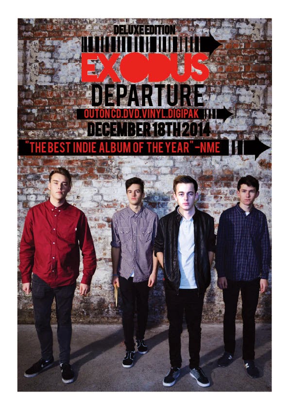
Final Advert

This is the finished advert. I made the advert as simple as possible so that it could be easily seen by all audiences. We have kept to a simplistic and stylish theme so that the band were easily recognized and created a brand for themselves. The main colour scheme was black and red. This was because it is the main colour scheme within the logo and this meant that the band could be associated with the colour scheme. This meant further branding for the band.
The digipak background was against the decaying brick wall in which we shot this image also as it meant that the two could be linked together. This allowed the location to recognized By keeping the background of the band the same, it meant there was a continuity throughout the project as the location of the performance was filmed in the warehouse and the images for the digipak and advert were also shot here.
When important information had to be told, I added a background of the conventional arrows. This used the logo continuously throughout the advert and meant it had a common trend throughout. It also meant that when the audience was reading the advert, all important information was written on an arrow would recognized the future as the band exodus's arrow. This was another idea to brand the band.
I used the same font from the digipak with was a downloaded font called BEBAS. I wanted to carry on using the same font so that it all linked together and combined the two products as one. I used the red font throughout which could also be shown through the logo and meant the logo and the advert were also linked. The image that is used is found in the digipak inside cover which meant it easily identified for the audience of EXODUS and could also be used a poster.
Tuesday, 2 December 2014
Photoshopping Lewis's Head
As the inside cover was the band walking towards the audience. A lot of the feedback that I had informally received in class said that Lewis's Head should of been facing the audience. As we did not have an image of the 3 band members looking up with Lewis doing the same, I took to photo shop in order to edit one of the images I had of Lewis looking up into the photo in which I wanted to use.
I first of all select the photo that I wanted to transfer and copied Lewis's head to the other image by using the selection tool. Screenshot below.


I first of all select the photo that I wanted to transfer and copied Lewis's head to the other image by using the selection tool. Screenshot below.
This allowed me to copy the image over the image. I then changed the colour of the image which was currently just a layer sitting on top of the image with the other band member looking the correct way. I used the adjustments within photoshop to do so. This is shown below in a print screen too.
After carrying this out I resized the head that was on top of the image I wanted to fit Lewis Body in order to make the new head look realistic. This was difficult however it was manageable.
I created a mask then to blend the likes of his neck into the skin and also this allowed me to match the brick work again as this would of been in a different formation to the other image. The mask looked like this:
To edit the mask, I used the white brush to get rid of anything that I did not want to be seen and also the black to show things from the layer I was editing. This would allow it too be seen. It was possible to change the brush size in order to make the editing easier and look smoother.
The Before and After of the photos are shown below.
Before:
After:
Monday, 1 December 2014
Creating the Logo Arrow
I created the logo using Fireworks. This was a graphic software which I was very familiar with due to taking ICT for many years. After carrying out the target research, the clear winner was our favourite also, this was definitely a benefit as it meant that i got to create the one I felt was the best also.
I downloaded a font from dafont.com which allowed me to type the band name in. This was called Revolution. I added this font to fireworks and then began to make an arrow.
The Screen cam below shows how I made the arrow on the logo. I found the arrow on Google, and replicated it onto fireworks, this was only the arrow head and from here I then added more black lines to extend the arrow so that it filled the top of the EXODUS text. This is demon straight below in the video by using the small rectangle tool from the vector box. I used a fill of 2 and the colour black to do this.


Sunday, 30 November 2014
Introduction to the Evaluation
The last part of the project is create a group evaluation of the whole project. We were given options in how to present an evaluation. These were:
- DVD Extras
- Presentation
- Blog
As a group we decided that we will present our evaluation as DVD extras. As these are dvd extras, each question must be separate videos. As there are four questions, we will create four videos. There is twenty minute time limit on the whole valuation, as if it is any longer it means that the evaluation is dragging on and is not concise enough.
Questions
1. In what ways does your media product use, develop or challenge forms and conventions of real media product?
2. How effective is the combination of your main product and ancillary texts?
3. What you learned from your audience feedback?
4.How did you use media technologies in the construction and research, planning and evaluation stages?
Band Logo Research Summary
From analyzing a number of different band logos, it became apparent to me that by using dull and minimal colours on the logo would look best and would fit the genre better. It also became clear that the by using a bold font that was simple to read would look best as it became almost a brand for the band yet also look professional as well.
I decided to design a number of different logos that fit this style that I wanted to go for and receive target audience on which one they thought was best. I will carry out the target audience and then begin to make the one with the votes.
I decided to design a number of different logos that fit this style that I wanted to go for and receive target audience on which one they thought was best. I will carry out the target audience and then begin to make the one with the votes.
Evaluation Question 1
In what ways does your media product use, develop and challenge forms and conventions of real media products?
Question one is the question that needs to have in depth, and detailed evaluated answers. The easiest way to look at this question is to break it down into 9 mini questions. We have to answer this for all 3 of our products, the music video, digipak, and the advert.

The 3 words circled in red are the most important words we really need to take into consideration for this question. As we need to answer for all 3 products we must answer how the 3 products use, develop, and challenge forms and conventions separately in much further detail.
Our group member, Laura, will study and analyse this question, evaluating all 3 of our products. There will be a script created for this question to make it easier for our DVD extras. As this is quite a heavy question, we have decided to just talk with our visual points behind us on the green screen rather than styling it into a famous show. We decided we want to be able to put our points across in lots of depth rather than getting carried away with a question theme.
Question one is the question that needs to have in depth, and detailed evaluated answers. The easiest way to look at this question is to break it down into 9 mini questions. We have to answer this for all 3 of our products, the music video, digipak, and the advert.
The 3 words circled in red are the most important words we really need to take into consideration for this question. As we need to answer for all 3 products we must answer how the 3 products use, develop, and challenge forms and conventions separately in much further detail.
Our group member, Laura, will study and analyse this question, evaluating all 3 of our products. There will be a script created for this question to make it easier for our DVD extras. As this is quite a heavy question, we have decided to just talk with our visual points behind us on the green screen rather than styling it into a famous show. We decided we want to be able to put our points across in lots of depth rather than getting carried away with a question theme.
Saturday, 29 November 2014
Band Logo Research: Two Door Cinema Club

Two Door Cinema Club have a very convention logo being a part of the indie music genre, as the designer has used very minimalistic colours and fonts. By using is idea of minimalistic themes it will suggest to their audience that the band are very serious able there music and a band image isn't at the top of there list. On our logo we could use this idea of minimalistic themes as we want our band to express to our target audience that they only do it for the music.
Similar, to main other indie bands such as; The Black Keys and Arctic Monkeys, their fonts are all very bold in each logo. Two Door Cinema Club's logo does not differ. By the band choosing this type of font it could make this band stand out and the logo will be able to be seen from far away. In our logo will probably use a very stand out and bold font to be able make sure that our logo stands out from the other groups in the class.
However, th
Band Logo Research- Arctic Monkeys

Arctic Monkeys have the same style and the conventional logo of a indie music band. They use a bold font and minimal colours. I feel like by using these conventions in our own logo will allow the logo to look more professional and suit the genre of music.
After researching the oasis logo and now this one, it is definite that a bold font is used to ensure that the band have a specific font almost assigned the band to create a small branding for them. I will use the dull and minimal colour scheme to ensure that the logo fits in well with the genre also.
I think this font is hard to read, and is not easy on the eye and therefore I will use a more basic bold font that can be easily identified as EXODUS but also so that it stands out from other indie bands logos.
Band Logo Research- OASIS
The oasis logo is very simple and plan. It involves two colours which make it stand out however it entails the stereotypical dull and minimalist colour scheme that most bands go for. I decided to use this convention with the logo, as I felt it was more recognizable and looked more professional. The bold text in the middle of the rectangle stood out against the background and was bold enough to see without the rectangle also. I will use a a bold font for the name of the band when creating ours as it looks more professional and will also more recognition for the band as it can be seen more.
I like how the outside of the logo is a box and then another box as it compliments each other, enabling it to stand out on a white background and any poster it would be put on. I will take this on board when creating the logo as it ensures that the logo stands out against the page. I will use a simple vector shape in order to do this.
Thursday, 27 November 2014
Wednesday, 26 November 2014
Final Cut deadline day
Today is the day where our final cut of our music video must be handed in. If we do not export our music video into the right file at 4:30 we get marks docked from our overall project. As this is a highly stressful day editing must be a priority. However, today we were told my our teacher that the ending of our video must be much strong. So, last minute we filmed some green screen scenes using the petals from our final dance scene filming session. As this was last minute filming, we had to editing all day. However, we were sharing a computer with another group which made it much harder to be able to edit to our best ability. Hopefully we will finish it by 4:30 without any problems.
Tuesday, 25 November 2014
Digipak Barcode
We had created the barcode on the digipak so that it was a realistic CD. a I had the choice of downloading the barcode font from the website, 'Dafont.com' which helped you create your very own barcode with no copyright, or I could create my own on Adobe Photoshop using the basic tools.
By downloading the font, we created our own barcode by using the font on photo shop which was then transferred on to the finished design on In design on the back cover. The barcode was created on a white background using a black font on the barcode. This was the typical convention of a barcode.
I exported the image on photo shop as JPEG and inserted it on to In design.
Final Digipak

This is the final digipak cover our group member, Bethany, has created. We have tried to stick to the feedback from our digipak research and keep it simplistic and stylish, with that indie/alternative edge. We have a distinct house style of fonts and colour scheme. Our main colours used as you can see are black white and red, with an additional sepia theme cover photo with a brickwork background for a little extra effect. As you can see the cover and the disk have been linked in terms of the background brickwork to make the bricks a distinct convention of our digipak. The back of the digipak had to consist of a realistic track listing along with extra elements such as a barcode and bonus tracks etc. After looking at our target audience feedback, we listened and came up with 12 tracks and 4 additional bonus tracks including our music video "Tiptoe". An additional aspect of the digipak is a description of the production company, presented in a small font under the track list, along with the logo of "Warner Brothers" which is also presented in the spine of the album and on the disc. All of these elements are realistic and typical conventional items that are seen on a real digipak or album. To add some extra conventional elements on the front cover, the album name "Departure" has been presented under our band logo, and above this, it has been branded as the "Deluxe edition".
Around 2-3 fonts have been used to stick with the simplistic and indie style of the digpak. The majority of the font work and text is also in capitals as we found this was quite a common aspect of album artwork after looking at some example digipaks during our research. The inside photo of the band against the brick wall is in different effect and colour to create a slight, little contrast with the rest of the digpak. This has been done so the whole digipak isn't all the same and isn't too simplistic. The photo used is a naturally posed, action shot of the band members walking towards the camera. The lead singer having his eyes closed is our simple way of him being singled out from the other 3 band members, showing him as the star of the band without the common and overused positioning of a lead singer standing in the front. The plain facial expressions is also used to help us achieve the laid back style, presenting them as not too serious, to steer away from the indie/pop style genre. We found from bands such as arctic monkeys and the 1975 that they tend to use a chilled out pose or position on their album covers, or sometimes they don't even use an image of their band at all.

Monday, 24 November 2014
Creating the Digipak
The digipak was straight forward to make, I used a template which had the stereotypical conventions of a digipak, which was 4 panes. The four panes, would be front cover, inside cover, the disc and then the back cover. After carrying out the research at the start of the project, we easily recognized the regular conventions of the indie genre. This allowed us to replicate a similar digipak that would suit the genre.
I was in charge of making the Digipak and advert, Throughout the digipak, I used a minimal colour scheme using the colours of the bands logo, red, white and black. I also incorporated a dark grey for the background of two of the panes as this still remained minimalist and fitted well with the background. It was important to make the digipak look as professional as possible and so that it fitted in with regular conventions of an indie band.
I made a small plan of the way I wanted to lay out the digipak so that it matched a number of others bands conventions.
Bottom Left Pane: Songs on the Album including Bonus Track
Bottom Right Pane: Image on Front Cover
Top Left Pane: The CD disc.
Top Right Pane: Inside Cover which would be an image of the band.
24th of November - Final dance performances filming session
Today, we shooted our last few dance scenes for the narrative, which was our last ever shoot for this project. The location for the group dance scenes was the same as our rough cut as it looks very proffessional and with mirrors we are able to achieve some amazing symmetry shots. Furthermore, we used this location as on our rough cut feedback we were advised to keep the location for these scenes the same.
However, in this shoot we used white rose petals as a prop. We decided to include these into our video as they can symbolise someone being pure and calm and this is the image we want for these scenes, as we want to create a heavenly mood. Additionly, we decided that it would be a great idea to throw them and spread around the room. We used a wind machine to achieve this affect.
In this filming session, we collectivly used many pieces of equpiment to achieve all possible shots as this was the chance we would have to film these last scenes. The equpiment we used was LED lights, red heads, crane, dolly and shoulder mount. One of the piece equpiment we mainly used was the crane, as we were able to create long sweeping pans of each dance sequences. Another piece of equpiment we used prodominantly was the shoulder mount. This piece of equpiment was great to use as we were able to achieve main different angled mid-shots. Which would match the conventions of the dance films and music videos with dance incorperated into them.

Sunday, 23 November 2014
23rd of November - Our narrative scenes filming session
Today was the last filming session for the narrative parts of our music video. The last few scenes we shot were for the bully section of the video. The location we used was an underground subway in Monkseaton. We chose this location as it is very dirty and neglected. Furthermore, it looks like the stereotypical place where the characters who attack our main actor would be.
We didn't use many piece of equpiment as we wanted these scenes to be very real and gritty. So, we used LED and the shoulder mount to create these shots. We used the LED in the shoot as we wanted the footage to be grey and dark. As we were filming outside. In this filming session we used the shoulder mount to be able create close up shots of the abuse our main character is recieving. Furthermore, we also used the shoulder mount to achieve shots that made the audience feel that they were right there with them while the main character is being abused.


Monday, 17 November 2014
Digipak questionnaire results and analysis
Our group memeber, Laura, has designed a questionnaire for research on the digipak. I asked 20 people of the age range 16-20, 9 questions to find out a little more information about what they would like to see on a digipak. We will use all of our results when coming to designing the digipak. I have put the questionnaire results into different graph styles to make it easier and clearer for you to see when i come to talking about each question.
Question 1:
What would you prefer to see on the front cover of the digipak?
A: A scenic photograph
B: Band photo
C: Artist illustration
D: City landscape

As you can see from the pie chart above, over half of the audience members i asked said they would prefer to see a professional band photo rather than the other 3 options. I think this is because many current artists/bands tend to do this on their album covers. Also, an image is better for recognising the band, and when the audience want to connect with the band or artist. Since our aim is to make the band seem as realistic as possible, a band photo would be the best option as it is realistic, a common aspect, and our audience is able to connect our video with the album more clearly.
Question 2:
How many songs would you expect to see on the back of the album cover?
A: 5 to 10
B: 10 to 15
C: 15-20

The bar chart above clearly presents that the most common answer for this question was 10-15. In my opinion i would have gone for this option aswell as it is just the correct amount of songs for an album cover. I feel and i think the audience would have felt that 5 to 10 would have been too less and 15 to 20 would have been too many. This brings us to the next stage of making up appropriate named songs. The songs are important because they need to be realistic and suitable for an alternative/indie album. It would also be good if we included some live versions, or remixes of the songs on the back for a more conventional look.
Question 3:
What kind of colour scheme do you think would be suitable?
A: Simplistic
B: Mysterious
C: Bright
D: Natural

The pie chart above presents that the majority of the members of our audience research group chose that they would think a Simplistic colour scheme would be the best choice for our digipak. A few of the members also thought the Mysterious colour scheme could look like a good colour scheme for the album, however the bright and natural colour scheme were less popular. A simplistic colour scheme is quite conventional for an indie album cover, as it is probably the most common style used in that genre.
Question 4:
Any extra elements for the digipak?

Half of the group of people thought that the most important extra element would be the album name. An album name is a very important aspect as it adds something to the cover. The element of a bar code was also quite popular. I can imagine this is because it is a realistic element for a CD. The production company and logo weren't as popular, however these could still be used for smaller elements on the back of the digipak.
Question 5:
How much would you usually pay for an album?
A: £5-10
B: £10-15
C: £15+

As clearly shown in the bar chart, people would usually bay around ten to fifteen pounds for a new CD or album. Price isn't extremely important for the digipak however i collected the result as a little more extra research in case we struggle to fill space.
Question 6:
Preferable album cover.
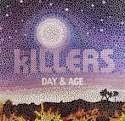
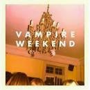
A: Florence and the machine
B: Arctic Monkeys
C: The Killers
D: Vampire Weekend


Question 7:
What usually catches your eye on an album cover?
A: Band name
B: Cover image
C: General text
D: Colours

The most common answer for what was eye catching on an album cover was the cover image. From this result we need to make sure that our cover image is the first thing the audience look at, and that it is so powerful it diverts the audience attention straight away from everything else on the page. The second most popular answer was the band name. Obviously this is a much needed element for a digipak. The band name also needs to be an element that attracts the audience's attention.
Quesion 8:
Do you think the album art work is important and should link with the music?
The majority of our questionnaire audience voted "yes" for this question. 2 out of the 20 people voted "no" and decided that it wasn't essential for the art work to be linked to the music style. I think in terms of colour scheme, logo and band name, there should be a link with the album tracks, however art work such as the photo or any other illustration isn't as important.
Question 9:
What do you think could be additionally added to the final product for a little extra effect?
A: Lyrics inside cover
B: Different versions of songs
C: Inside images of artist illustration

The most popular answer for this question was "B: Different versions of songs". I personally also think this is the best option as it makes the back of the digipak look more realistic. It is a particularly conventional think to advertise different or live versions of songs or something like a feature DVD movie. The second most popular option was "A: Lyrics inside cover". This also used to be quite a conventional element for an album however is not so popular anymore.
We will take all of this into account when coming to designing and creating our digipak. I think the results of this questionnaire has really helped our group for ideas, in creating a very successful and professional digipak.
1st photoshoot for digipak and advert
As well as filming our band performance we decided to make the most of our location and take photos for our advert and digipak of the band. In our location, there was neglected and old brick wall which as a group we thought would fantastic and fit the image of the band. Which we want to be as they are mysterious and bare. For the costumes, we decided that we wanted our lead singer to stand out from the rest of the band which would match the conventions of an indie band. Looking at bands like Imagine Dragons and The Killers, the lead singer usually wears something like a jacket or jewelery to make them stand. We decided to go with a leather jacket for our lead singer. This creates the image that suggests that he is quite rebelius and will escape the social norms. Below are some pictures of the photoshoot taking place...


Sunday, 16 November 2014
16th November Filming Session
In today's filming session we decided that we would film one of the section of the narrative where we finally meet the character's mum. These show the real root of the boy's insercurtities about dance, which start with his mother unacceptance of his passion for dance. Our location for these scenes was a house in West Monkseaton. As a group we decided that this house would be a great location has it would be free to use (as it was one our members of the group's house) and it was in a surban area which would be relatable to our target audince as they would feel like that this could be happening to be around them and maybe including their friends!
Lighting played a major role in this filming shoot, as we wanted to create a grey and dark atmosphere which would reflect the life of this boy. In which we want it to be very somber and uncolourful. We used many LED lights to be able to create this affect of dark lighting but still be able to highlight our actors. Furthermore, by using LED lights it will stop the footage from going yellowy and give the grey affect.
In this filming session we didn't really use much equpitment to be able to give a hand-held affect. The only equpiment we used was the camera, tripod and the LED lights. The reason why we decided to film these scenes hand-held was that we want to feel like the audience will be following the events of the character, unfolding right in front of them. Below is some pictures taken from the location...


Saturday, 15 November 2014
14th of November Filming in Action
In this filming session, we decided that this space would be best to film our band performance. Below are some photos of filming taking place at our location.


Friday, 14 November 2014
14th November Location for our Final Cut Band Performance
Today was the final shoot for the band performance for our final cut of the music video. The location we used was warehouse 34 in Hoults Yard, in Byker. This location was amazing to used as it was big, wide open space. Furthermore, it was very industrial building, which matched the image we wanted for the band to be very mysterious and dark. This spaced that we hired had many different aspects to it, as there were white brick walls we could use for lighter shots and darker neglected brick walls for the dark and dramatic shots. Below are some photos of the location we used for this filming session.


14th November Setting up Equipment
In this band performance filming session we booked out many different pieces of equipment to be able to achieve the best possible shots in the time frame we had. The equipment we used was staging (provided by the location), the crane, the dolly, three redheads, smoke machine, tripod and two LED lights. It was a massive operation to get everything to Byker but it was worth it! Furthermore, we also used many different instruments to make our band look professional, such as: a drum kit, microphone and stand, keyboard and guitar.
The staging that was provided by the location was great addition to the music video as we could deliberately pick out certain members of the band to used the convention of the lead singer being shown to be the most important member of the band and the drummer being the highest point (visual) in the band, which can be shown using levels. We built the stage up with a formation of:


However, we also had to set up many different technological equipment. The crane that we used came in handy to achieve big master shots of the band to show the location and lighting off. But also the crane help us to be able to film close up shots of the different members of the band and adding movement to them. In addition the crane was good to film static master shots of the band as well. In this film session we also brought three red heads and LED lights. The red heads were used to highlight the band and change colour of the room. On the other hand, we used the LED lights to highlight certain members in the band, in two-shots we shot. In this filming session, we also used a smoke machine. This was a privilege to be able to use this as it really made the image of the band being mysterious and dark, as it looked like they were appearing from the smoke. One of the other pieces of equipment we used was the dolly. In this filming session we used the dolly to create slow pan in the master shots of the band. As the surface in the warehouse we used was very bumpy so we had to place the dolly on some staging so we could get clean shots instead or jerky.
The staging that was provided by the location was great addition to the music video as we could deliberately pick out certain members of the band to used the convention of the lead singer being shown to be the most important member of the band and the drummer being the highest point (visual) in the band, which can be shown using levels. We built the stage up with a formation of:
Drummer
(Jamie)
Guitarist Keyboard
(Matty) (Bill)
Lead Singer
(Lewis)

However, we also had to set up many different technological equipment. The crane that we used came in handy to achieve big master shots of the band to show the location and lighting off. But also the crane help us to be able to film close up shots of the different members of the band and adding movement to them. In addition the crane was good to film static master shots of the band as well. In this film session we also brought three red heads and LED lights. The red heads were used to highlight the band and change colour of the room. On the other hand, we used the LED lights to highlight certain members in the band, in two-shots we shot. In this filming session, we also used a smoke machine. This was a privilege to be able to use this as it really made the image of the band being mysterious and dark, as it looked like they were appearing from the smoke. One of the other pieces of equipment we used was the dolly. In this filming session we used the dolly to create slow pan in the master shots of the band. As the surface in the warehouse we used was very bumpy so we had to place the dolly on some staging so we could get clean shots instead or jerky.
Subscribe to:
Posts (Atom)